> ## Documentation Index
> Fetch the complete documentation index at: https://vendo-mintlify-24213046.mintlify.site/llms.txt
> Use this file to discover all available pages before exploring further.
# Mount the surface
> The provider, the overlay, and slots: what each one renders and the props that move it.
One provider carries the wire and your brand. Everything below renders inside
it and reads the same token file.
## The provider
`vendo init` never writes a client file. It prints one paste at the end of the
run, with your layout path and the exact lines.
```tsx App Router theme={null}
// app/layout.tsx
import { VendoOverlay, VendoProvider } from "@vendoai/vendo/react";
import theme from "../.vendo/theme.json";
// then wrap the app:
{children}
```
```tsx Pages Router theme={null}
// pages/_app.tsx
import { VendoOverlay, VendoProvider } from "@vendoai/vendo/react";
import theme from "../.vendo/theme.json";
// then wrap the app:
```
`baseUrl` is where the route is mounted, path prefix included. A deployment
served under `/maple` passes `baseUrl="/maple/api/vendo"`.
If init also wrote `.vendo/fonts.css`, import it beside the theme so generated
screens use your brand font where your own stylesheet does not reach.
### The props
| Prop | What it does |
| ------------------------------ | ----------------------------------------------------------------------------------------------------------------------------------------- |
| `baseUrl` | The wire mount, path prefix included. Default `/api/vendo`. |
| `theme` | Your brand tokens, merged over Vendo's defaults. |
| `components` | Your own React components the agent may render. See [host components](/generated/host-components). |
| `tools` | Labels and field formatting for tool chips and approval cards. |
| `routes` · `onNavigate` | Your pages by name, and your router doing the moving when a generated link is pressed. |
| `intl` | Display currency and locale for every formatter. Defaults to USD and `en-US`. |
| `greeting` · `discoverability` | The first-run intro and starter prompts. `"quiet"` stands them down. |
| `captureScreen` | `false` stops the page snapshot riding each send. Data you publish with `useVendoContext` still rides. See [Context](/customize/context). |
A component registry has to live in a `"use client"` file. Declare it in a
Server Component layout and React Server Components serialization crashes
once the registry holds real components — every page 500s.
## The overlay
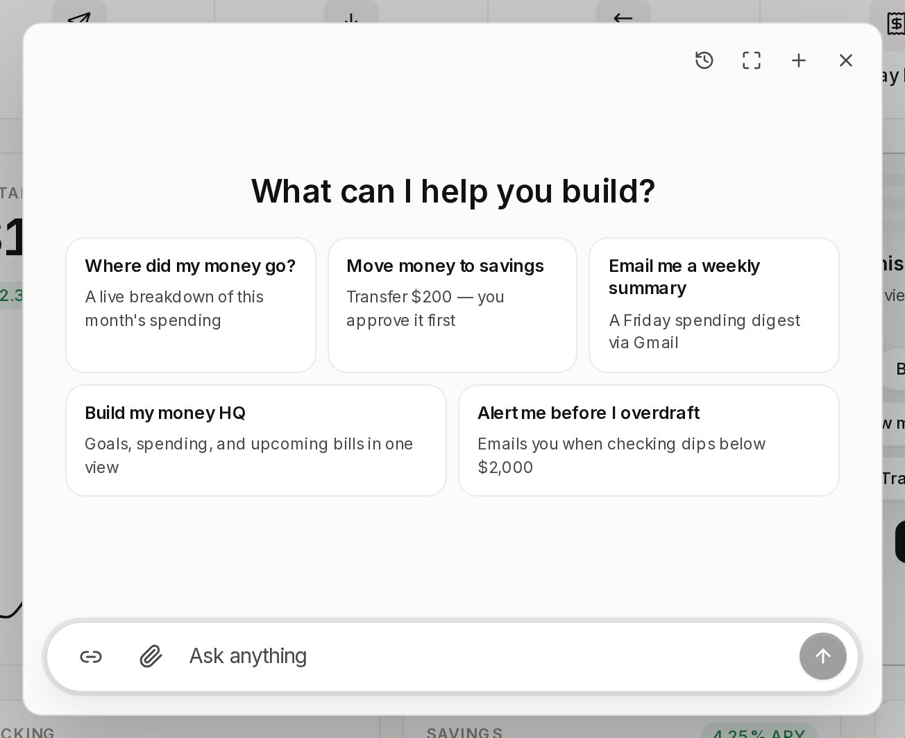
The conversation panel. A bare `` puts nothing on the page: it
renders once something opens it — `useVendoOverlay`, a `VendoTrigger`, or a
slot. Below 768px the panel becomes a full-bleed takeover.
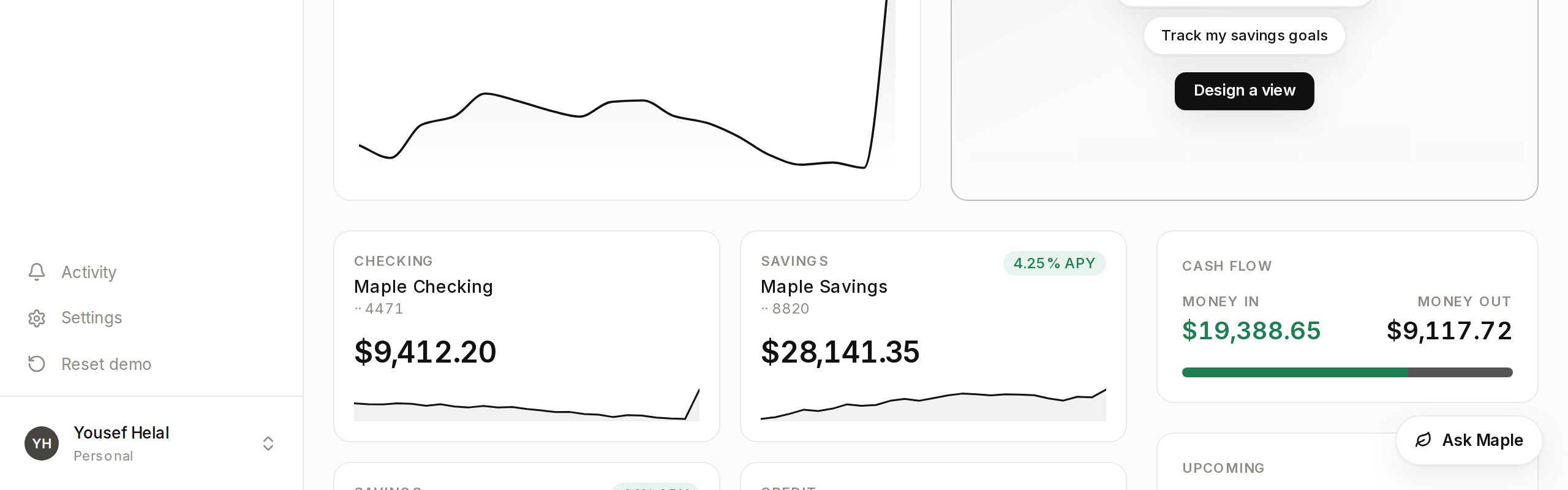
The `launcher` prop adds the built-in pill in a corner of the viewport. The
pill is white-label. It reads "AI agent" until you give it your own label and
mark.
```tsx theme={null}
,
}}
/>
```
`launcher={{}}` gives you the pill exactly as it ships. `position` takes any
viewport corner and defaults to `bottom-right`. `offset` nudges the whole
cluster inward when your own UI already lives in that corner. The
discoverability whisper and the completion toast ride the pill, so with no
launcher they are quiet too.
### Where the panel sits
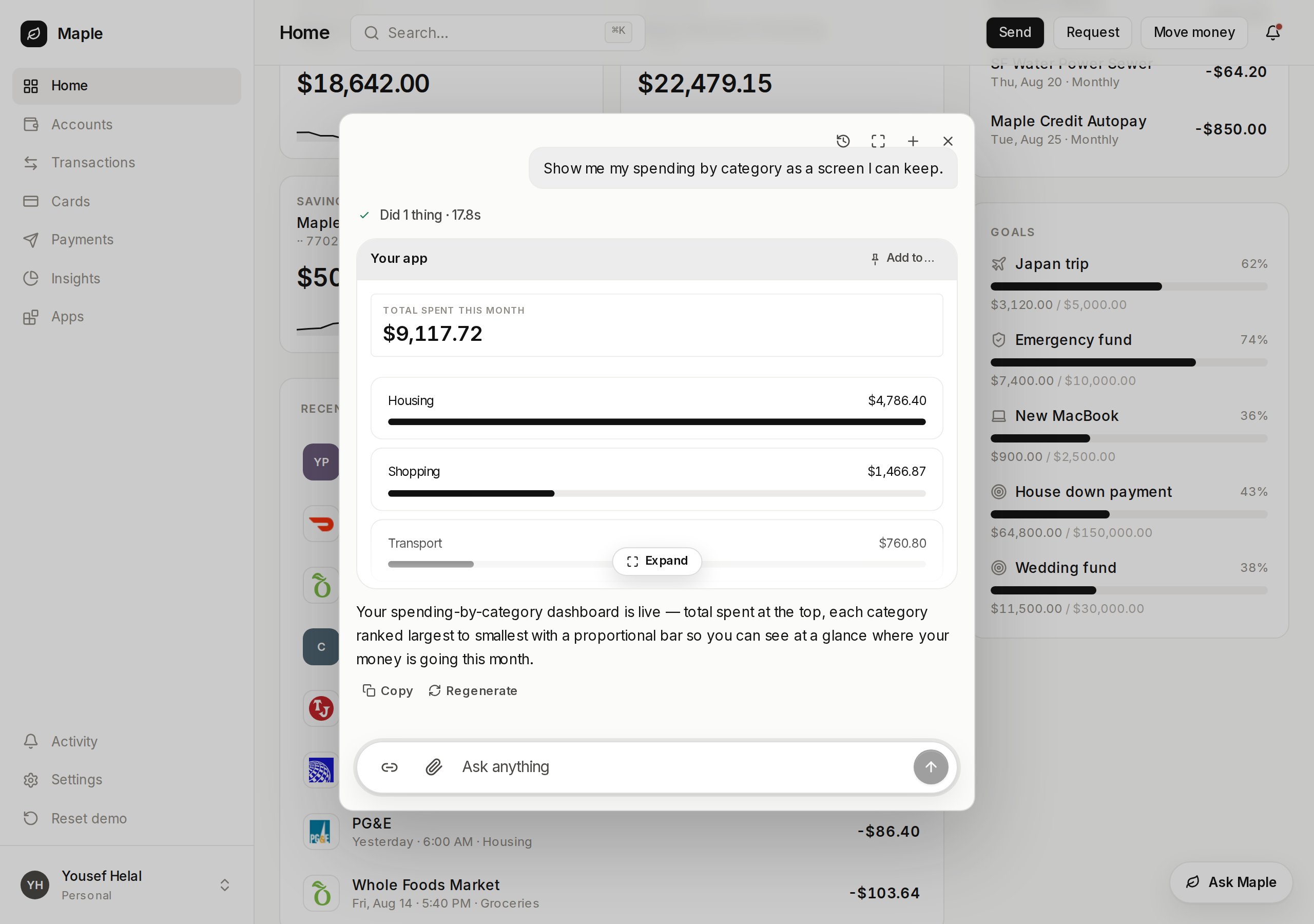
`placement="center"` is the default: a centered box over a scrim, with the
page behind it inert.
`placement="dock"` pins the panel to the right edge at full height. Your page
reflows beside it and stays visible and clickable.
```tsx theme={null}
```
`dockWidth` sets the panel width and the reflow together, so the two can never
disagree. It defaults to 420.
### Conversations survive
A reload resumes the conversation the user was in, mid-stream replies
included. The panel's header lists earlier conversations to pick back up.
None of that needs wiring. A remembered conversation that no longer exists
falls back to a fresh start.
### Drive it yourself
`useVendoOverlay` gives you open, close, toggle, and a fresh conversation,
plus the props to hand back to the overlay.
```tsx theme={null}
const overlay = useVendoOverlay();
```
The `thread` prop swaps in your own thread component. The overlay stays the
shell: portal, scrim, focus, and the mobile sheet.
Vendo binds no keyboard shortcut of its own — your app keeps every chord it
already owns. For a `⌘K`, hand your own listener `overlay.toggle`.
## Slots
A slot is a place in your own page that a generated view can occupy. It ships
in `@vendoai/vendo` — nothing extra to install.
```tsx theme={null}
"use client";
import { VendoSlot } from "@vendoai/vendo/react";
```
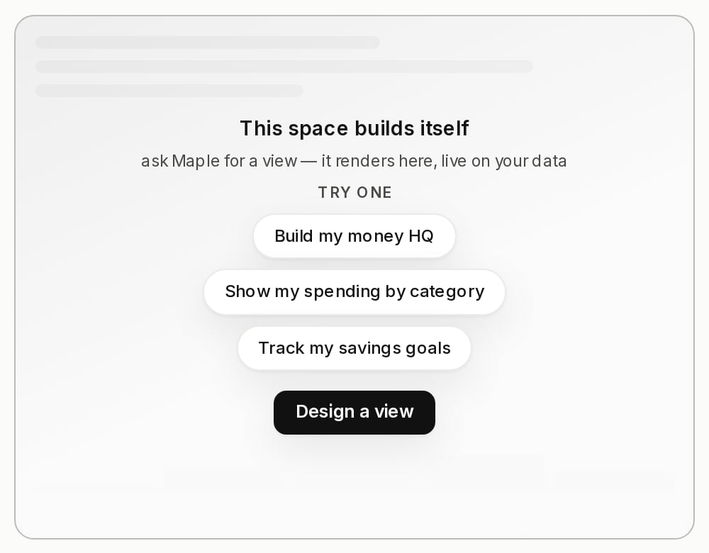
Empty, it renders an invitation: a skeleton, up to three prompt chips that
prefill the composer, and a button that opens the panel. Filled, the view
mounts in place. If that view throws, the `children` you passed come back
instead of a blank hole — but `children` also stand in for the invitation, so
a slot that should invite must not have them.
Every mounted slot reports itself to the server, which is how the panel knows
which places exist. A slot that stops rendering ages out on its own.
`label` is what a person reads when they pick one, and it defaults to the id
read as words. `description` is optional: it is the sentence an agent reads to
pick between two slots a label alone cannot separate.
Pinning needs no wiring — a slot that exists is already a destination. With
one slot in your product, a finished view shows a one-click **Pin to
dashboard** and it lands there. With several, the same button becomes an
**Add to…** picker and the person chooses.
## Tool labels
Every tool call renders a chip, and a call that needs a decision renders an
approval card. Without configuration Vendo prettifies the raw id, so
`host_email_send` reads as "Email send".
Pass your own copy through the provider's `tools` prop.
```tsx theme={null}
const tools: ToolMetaMap = {
host_transferMoney: {
label: "Send money",
description: "Move money between your accounts.",
formatField: (key, value) =>
key === "amount" && typeof value === "number" ? usd(value) : undefined,
},
};
```
`formatField` is display only. The raw arguments still drive the decision, so
formatting a field cannot change what the user is approving.
## Approvals on a generated screen
When someone presses a button inside a generated view and that press needs
approval, the ask arrives as a modal centered over the page.
Presses queue, and exactly one modal is on screen at a time. Escape and the
scrim close it without deciding, so the ask comes back on the next press.
The modal is mounted for you inside `VendoSlot`, in-thread app cards, and the
panel. The decision itself is server-side: see
[what stops a call](/product/how-it-works#what-stops-a-call).
The token file every surface above reads, and how init fills it from your
own brand.
What a generated view can do, who owns it, and how it gets its data.
 `launcher={{}}` gives you the pill exactly as it ships. `position` takes any
viewport corner and defaults to `bottom-right`. `offset` nudges the whole
cluster inward when your own UI already lives in that corner. The
discoverability whisper and the completion toast ride the pill, so with no
launcher they are quiet too.
### Where the panel sits
`placement="center"` is the default: a centered box over a scrim, with the
page behind it inert.
`launcher={{}}` gives you the pill exactly as it ships. `position` takes any
viewport corner and defaults to `bottom-right`. `offset` nudges the whole
cluster inward when your own UI already lives in that corner. The
discoverability whisper and the completion toast ride the pill, so with no
launcher they are quiet too.
### Where the panel sits
`placement="center"` is the default: a centered box over a scrim, with the
page behind it inert.
 `placement="dock"` pins the panel to the right edge at full height. Your page
reflows beside it and stays visible and clickable.
```tsx theme={null}
`placement="dock"` pins the panel to the right edge at full height. Your page
reflows beside it and stays visible and clickable.
```tsx theme={null}
 ## Slots
A slot is a place in your own page that a generated view can occupy. It ships
in `@vendoai/vendo` — nothing extra to install.
```tsx theme={null}
"use client";
import { VendoSlot } from "@vendoai/vendo/react";
## Slots
A slot is a place in your own page that a generated view can occupy. It ships
in `@vendoai/vendo` — nothing extra to install.
```tsx theme={null}
"use client";
import { VendoSlot } from "@vendoai/vendo/react";